When a repeat client shows up on your doorstep with his third home to furnish and wants to start from scratch and go really bold, you just embrace him, scoot him right up to the resource room, and don’t ask questions! I mean, who does not love a client that embraces velvet, leather, silk and wallcoverings?
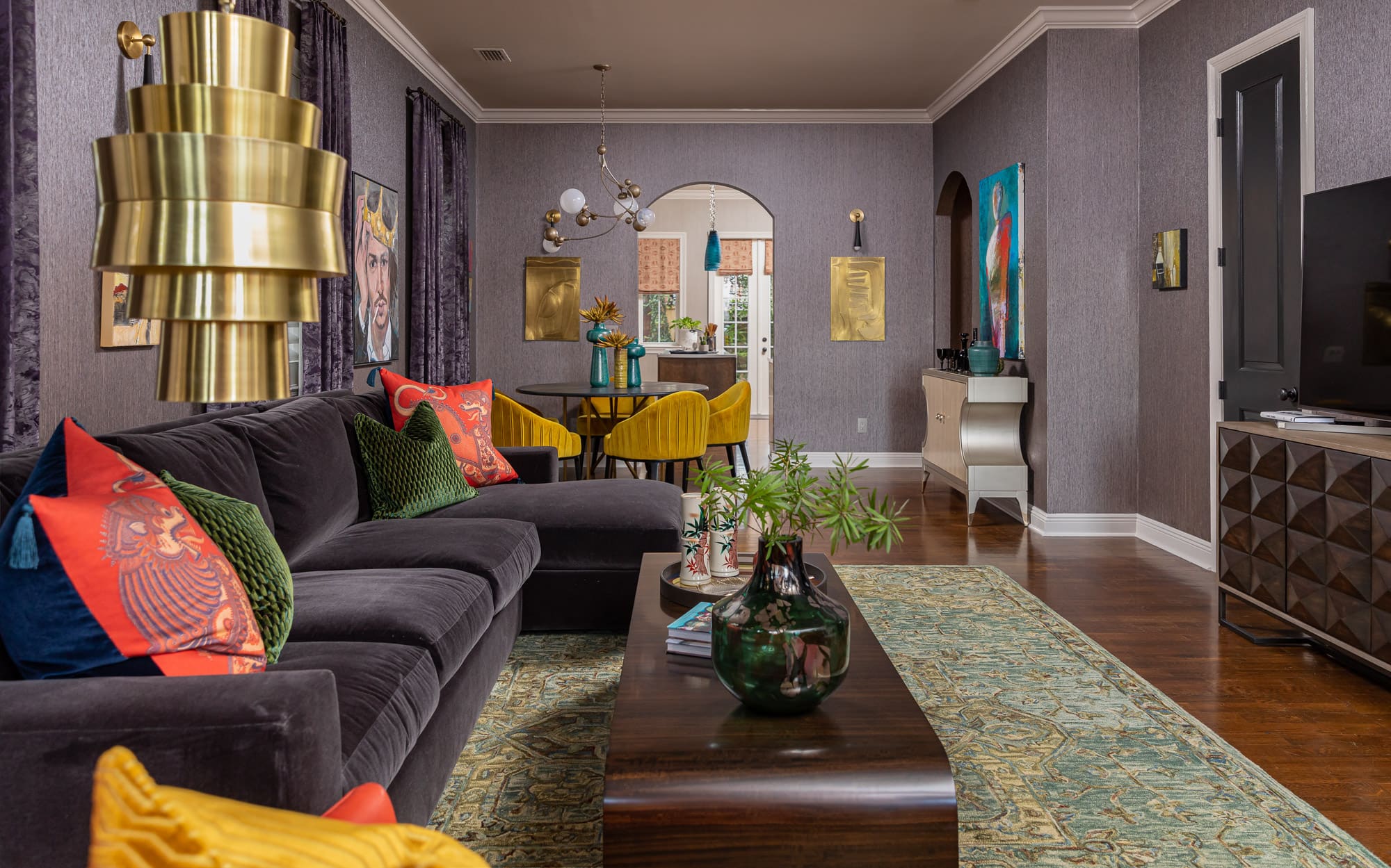
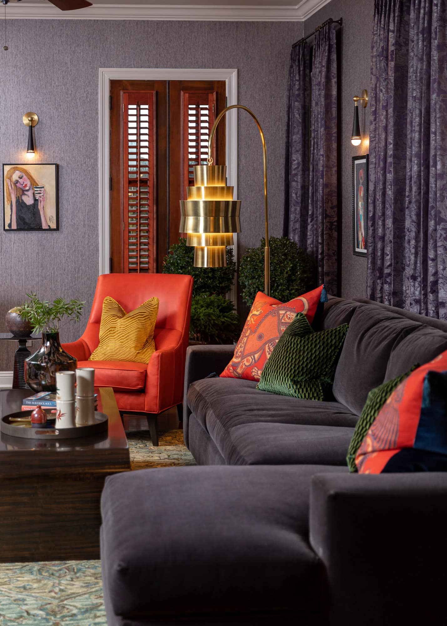
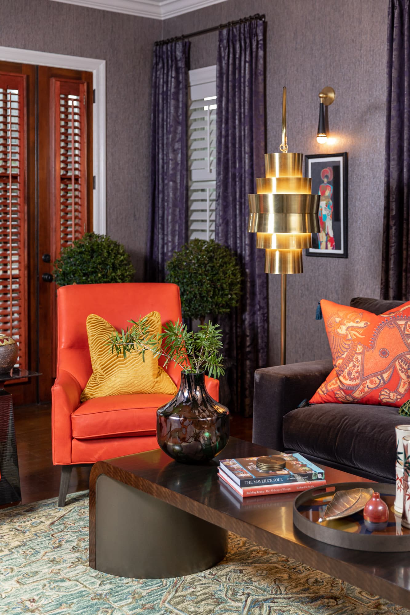
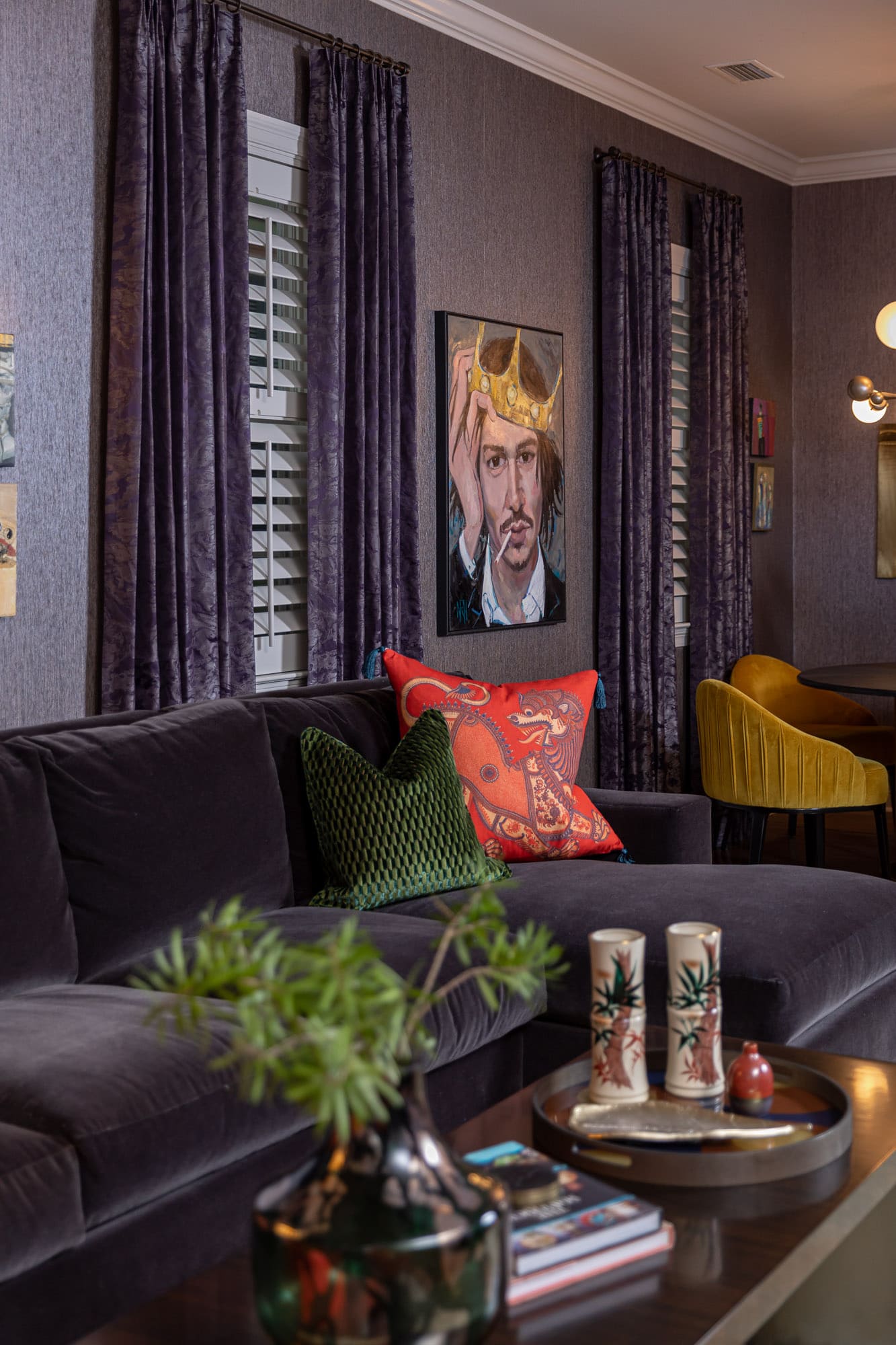
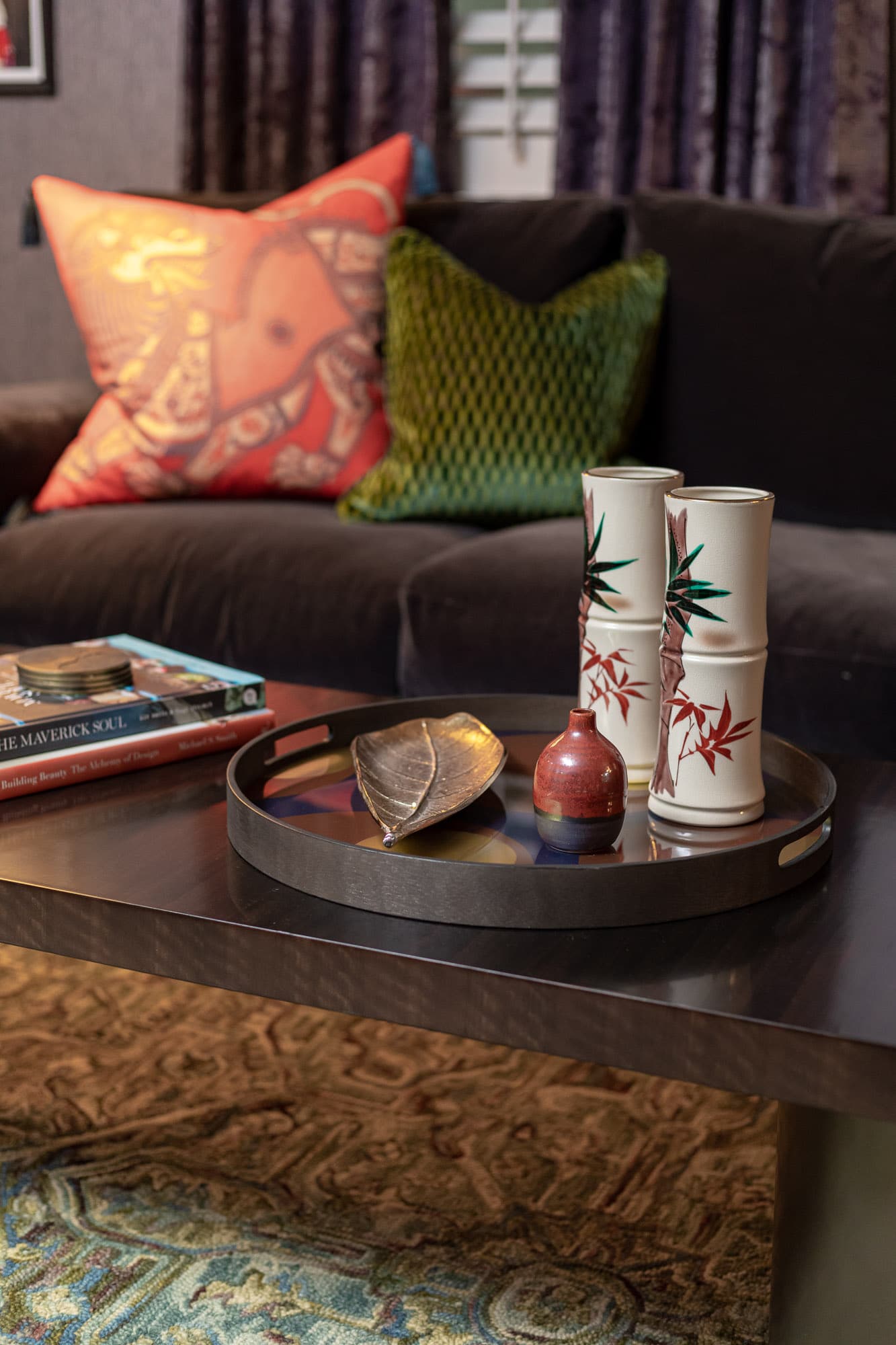
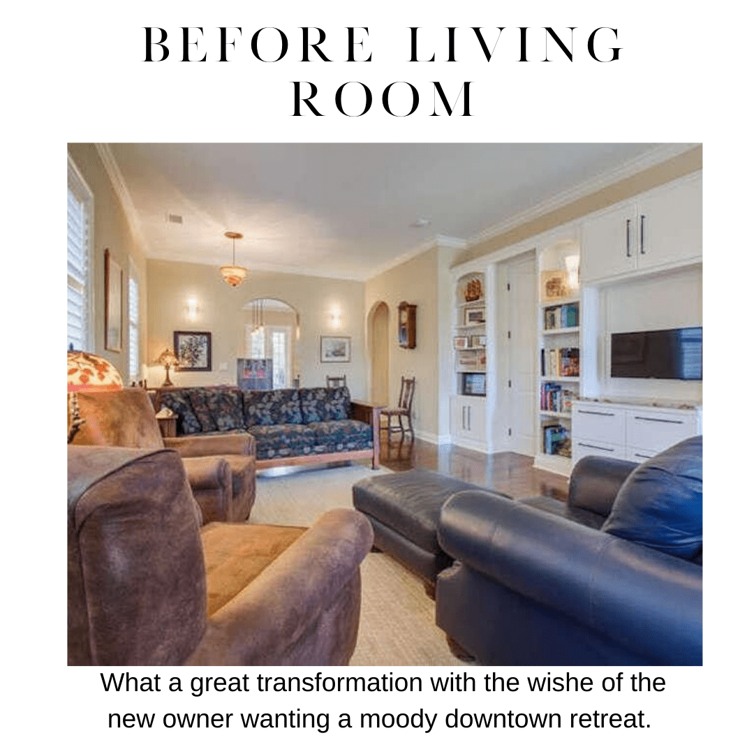
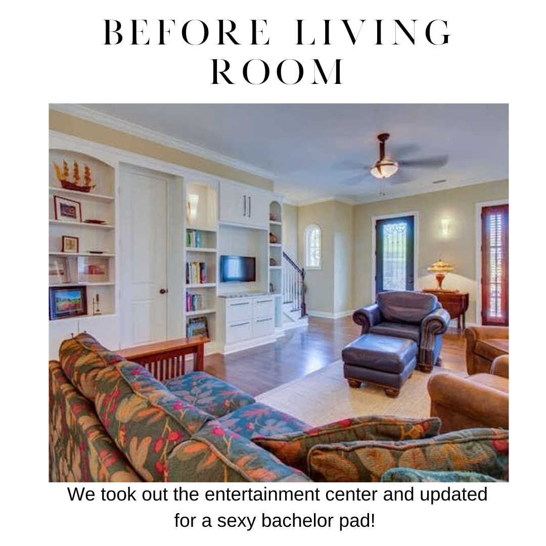
This lush, vibrant lounge space was all created from the want to really deep dive into something different, eclectic and more traveled. The original small, narrow, dimly lit room totally delivered on helping accomplish that mood. Mixing a little of that Ming dynasty-inspired strawberry red with a deep chocolate mohair on the sectional and cladding the room in a soft, amethyst woven wallcovering. We loved the interplay and “non-matchiness” that this space embraced.
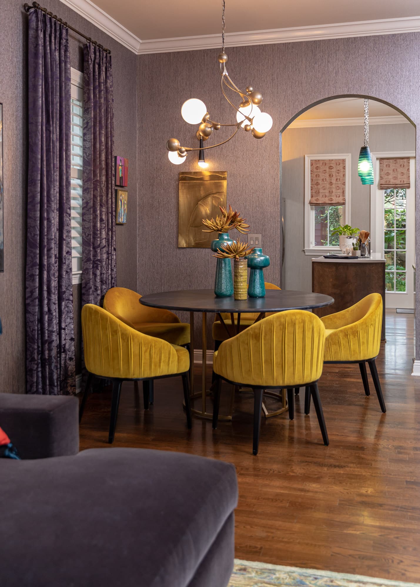
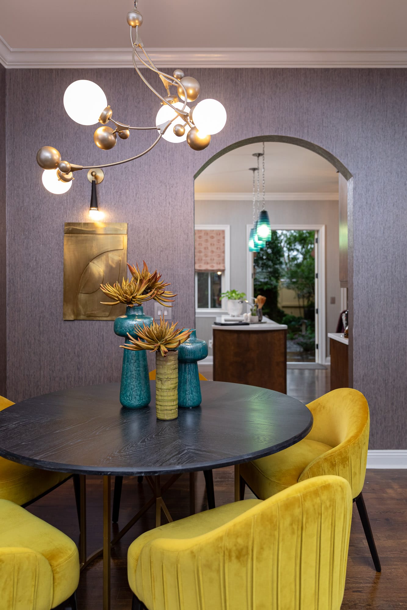
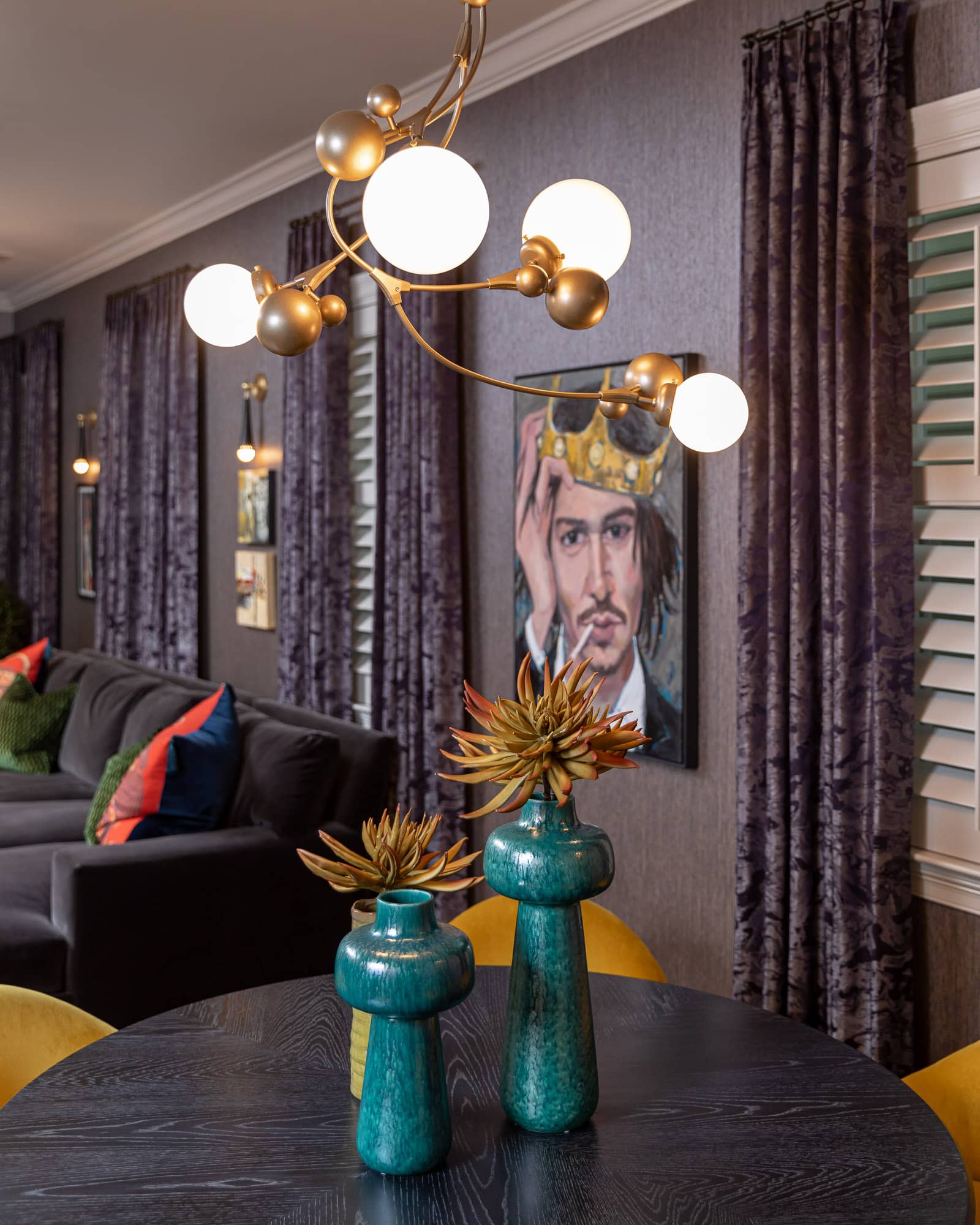
Lighting and art were both about telling a story in this colorful design – accenting conversational opportunities and an almost gallery-esque feel. Designating a more dynamic and unusual, sculptural feel – from the harder lines of the statement floor lamp in the living room across to the sprawling, slightly modern bloom of the dining area fixture.
Jewel of a space
The area rug had to ground the already bold furniture and lend itself to the darker wood floors, and a dusky green wool proved the ticket. We loved the almost pixelated pattern the hand-knotted wool lent to the overall design. A little hint of oxblood, chocolate and blue picked up in accents elsewhere, but the tone of almost jade really caught us about this piece.
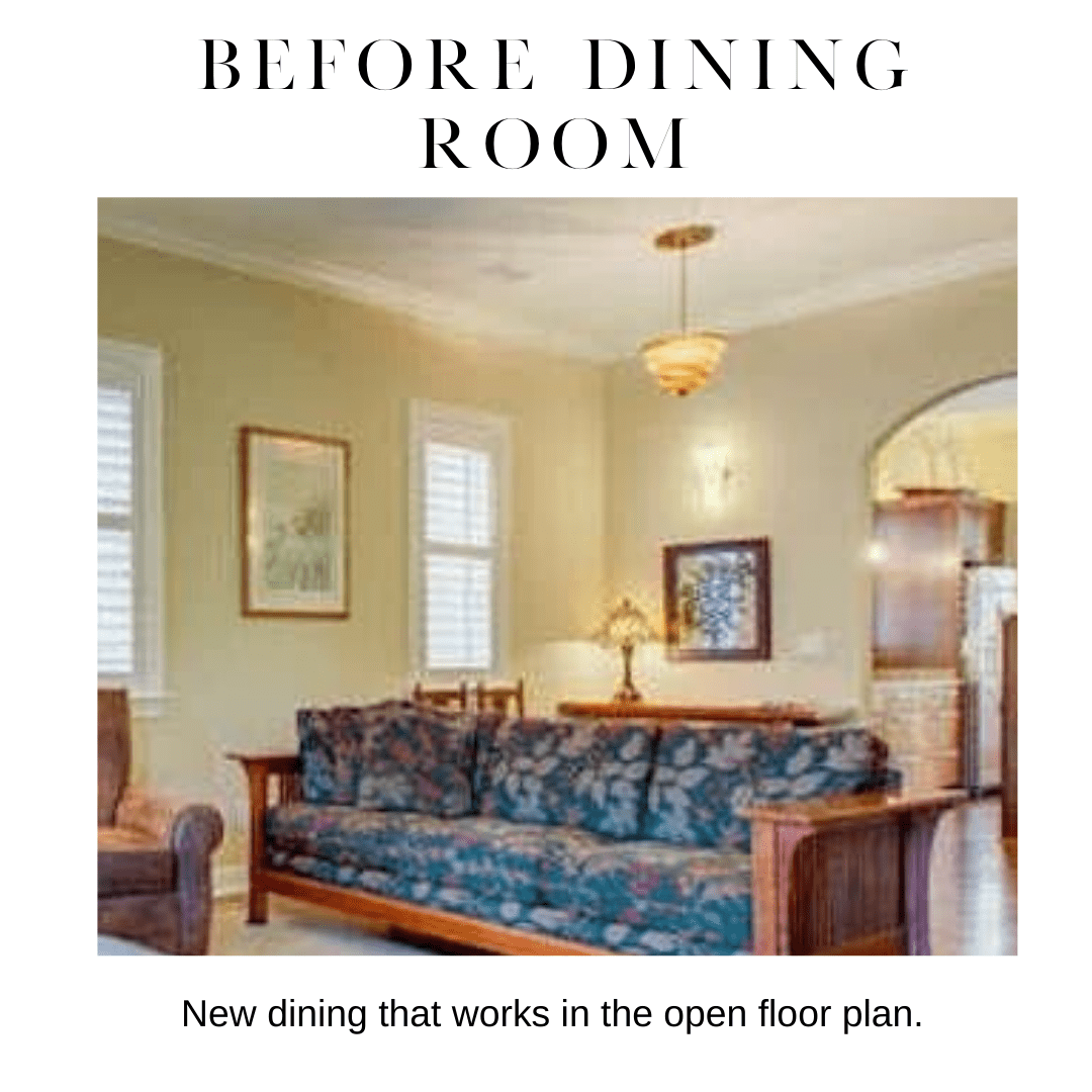
Not enough can be said about the accent of a dining space either (which in terms of space planning was the only way to balance this long, narrow “hallway” of a room off the kitchen). Citron velvet on the low-profile chairs left the space feeling open, but fun for games and cocktail parties. Plus, the cerused wood dining table was a great complement – offering depth without a conflict to the existing flooring or nearby sectional.
Being able to view this space as a whole was very important to us! From the selection of sconces carried throughout (that wonky placement was existing and with so little opportunity to add cans we had to play up the new fixtures in a way that make them feel purposeful and desirable.), to the balance of color and temperature in each furniture grouping. Sometimes working floor to ceiling in an existing space can pose a lot of unique challenges when it comes to furnishing projects. However, we loved that the client embraced our drive to really punch up the visual feel of this living/dining combo. Also, we know the enjoyment he gets from the finished product is a testament to hunting for the right pieces, designing with unusual and luxe fabric combinations, and managing the inclusion of budget-friendly surprises that always balance a job well done.
What the client says
“From the moment that Cheryl arrived, I felt that she was definitely the designer that I needed to help facilitate & execute my vision for the space. I’m not the “cookie cutter” type, and I immediately realized that Cheryl had a knack for envisioning ideas that were unique, yet tasteful, timeless, and sophisticated.”
From its beginnings as a plain Jane envelope, this combination living/dining space becomes a study in texture and color! Looking for more feels? Check out another colorful interior design HERE!


