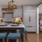
Too often people nervously approach the edge of their comfort zone when it comes to adding color in the kitchen and then quickly head back to the safety of blah. There is no reason to treat this area any differently than the rest of your home. If you enjoy color or just saturated hues, then consider adding a jolt of color or go so far as to be bold and paint your cabinets or walls with a dramatic shade or perhaps even the countertops become a focal area of intense color.
The key is balance and a little bit of guts. Any time you are considering working with bold colors, you need to think of balancing the intensity with more subtle anchoring shades somewhere in the design. Perhaps it is a dark wood floor to offset bold coloring on the walls or a light, soft hue in a floor tile that works well with darker shades of the cabinetry.
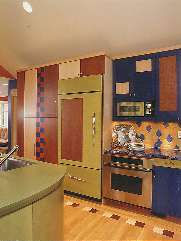
One kitchen that comes to mind all began with the client wanting a bold shade of aquamarine somewhere in the space. The feel of such a strong color needed to work with the rest of the home so a black glaze was used to soften the intensity. But the real trick was staining the rest of the cabinetry a rich walnut brown. This solid neutral wood tone helps make the island color stand proud but keeps it from overwhelming everything else in the room.
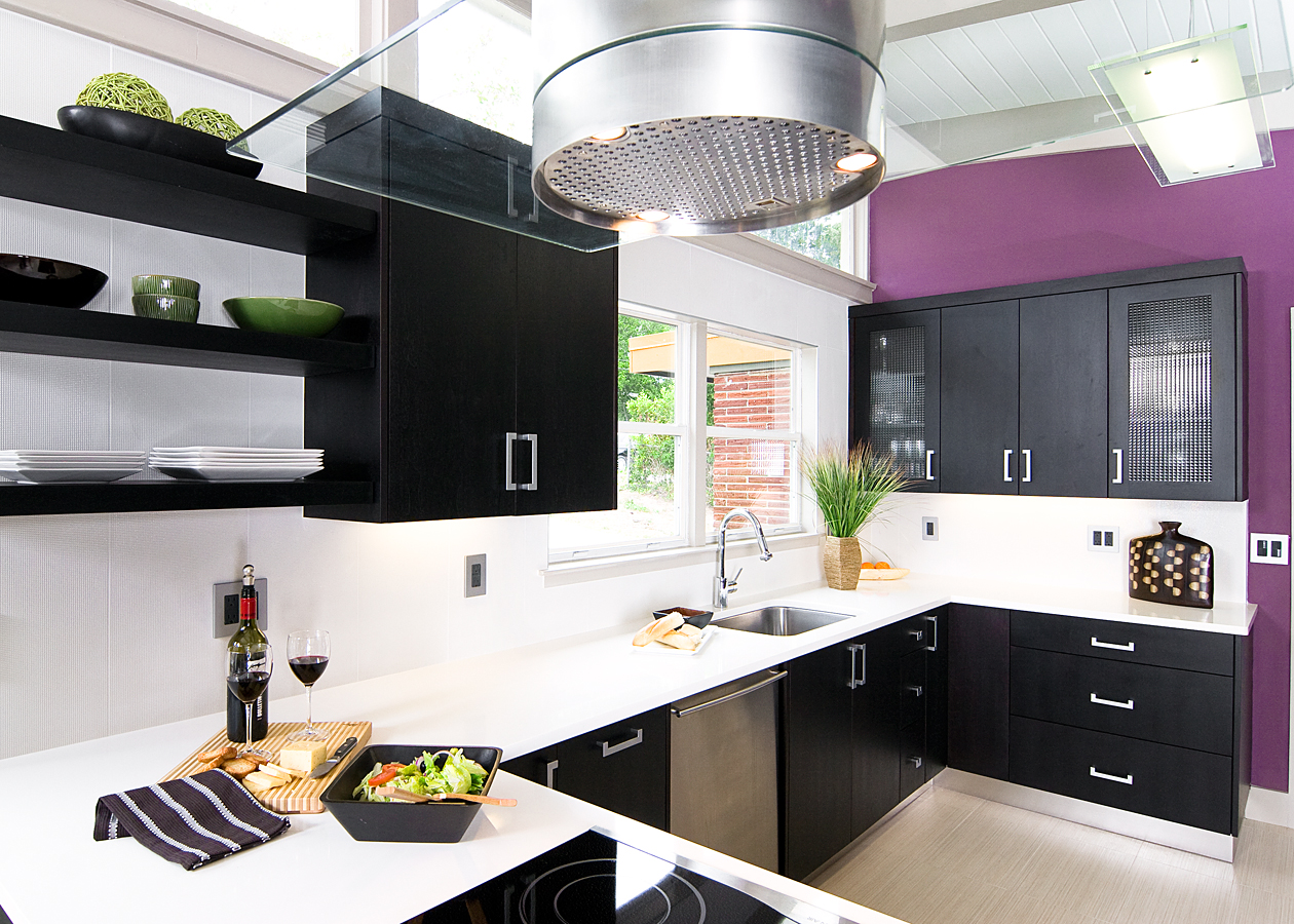
Yellow has emerged as a comfort color evoking old fashioned optimism and vitality. Expect to see all shades of yellow on walls, accents and appliances as well. Lavender purples are also making a strong design statement in small pops and even being used on the walls. Blues are still popular but are softening from the bolder versions of last year to more subtle shades mixing with some of the violets to appear softer. We are seeing blues, blue/grays, and green/grays on cabinetry, walls, and even counter tops.
Gray and gray/browns are becoming the standard neutral all over the home. Many more flooring options are coming in shades of gray from weathered gray wood flooring to gray tile and even natural stone heavier on the gray tones as opposed to the more common warm tan shades. All sorts of marble are showing up as counter tops and flooring in the kitchen and even the bath. Everything from classic carrerra marble to stunning Calcutta gold keep going strong and are appealing to homeowners who are choosing either modern or traditional style but prefer a soothing muted palette.
And of course we love our browns! A rich saturated brown with more chocolate than cappuccino is being found all over the house and yes, even on the kitchen walls! Say you have existing yet bland cabinetry, a rich nutmeg or espresso can bring about an element of drama and high contrast. Just be sure to tie it in with coordinating tones in the counter tops or backsplash.
And don’t forget the ceilings! Paint your ceilings a complementary shade to the walls or just a lighter shade of same color. The affect is instant and impressive and can give you just enough of a face lift to make it all seem fresh and new.
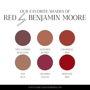
Ok, so what is some of our tried and true favorites for 2009? Benjamin Moore’s “Branchport Brown”, “Lightening Bug” “Greenbriar Beige” “Davenport Gray” “Beach Glass” and Pratt and Lambert’s “Abstract Blue” and “Sea Oat”.
www.prattandlambert.com
www.benjaminmoore.com


Comments
I love the yellow walls!
What’s the name of your company?
—————————————
signature: order valtrex
In Detail Kitchen and Bath! but we go by In Detail
The photo collection was so magnificent. I love the combination of colors. The choice of concept is well done. Thanks for sharing ideas about bkitchen layout. I would be glad to have that pattern on mine too. Of all places at home, this is where I most loved most. The layout is well planned I really admire it most. I’m looking forward to view of this some time. Smart post
Comments are closed.